Note
Go to the end to download the full example code.
Benchmark for time series
In this tutorial, we show how to use Qolmat to benchmark several imputation methods and a multivariate time series dataset. We use Beijing Multi-Site Air-Quality Data Set. It consists in hourly air pollutants data from 12 chinese nationally-controlled air-quality monitoring sites.
First import some libraries
import numpy as np

np.random.seed(1234)
import matplotlib.ticker as plticker
from matplotlib import pyplot as plt

tab10 = plt.get_cmap("tab10")

from sklearn.linear_model import LinearRegression

from qolmat.benchmark import comparator, missing_patterns
from qolmat.imputations import imputers
from qolmat.utils import data, plot
from sklearn import utils as sku

seed = 1234
rng = sku.check_random_state(seed)
1. Data
We use the public Beijing Multi-Site Air-Quality Data Set.
It consists in hourly air pollutants data from 12 chinese nationally-controlled
air-quality monitoring sites.
In this way, each column has missing values.
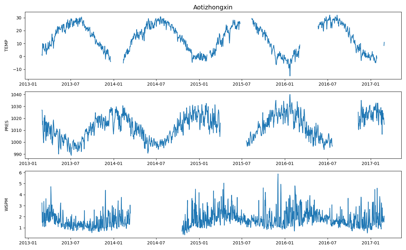
We group the data by day and only consider 5 columns.
For the purpose of this notebook,
we corrupt the data, with the qolmat.utils.data.add_holes function
on three variables: “TEMP”, “PRES” and “WSPM”
and the imputation methods will have access to two additional features:
“DEWP” and “RAIN”.
df_data = data.get_data("Beijing")
df_data = df_data[["TEMP", "PRES", "DEWP", "RAIN", "WSPM"]]
df_data = df_data.groupby(level=["station", "date"]).mean()
cols_to_impute = ["TEMP", "PRES", "WSPM"]
df = data.add_holes(df_data, ratio_masked=0.15, mean_size=50)
df[["DEWP", "RAIN"]] = df_data[["DEWP", "RAIN"]]
Let’s take a look at one station, for instance “Aotizhongxin”
station = "Aotizhongxin"
fig, ax = plt.subplots(len(cols_to_impute), 1, figsize=(13, 8))
for i, col in enumerate(cols_to_impute):
    ax[i].plot(df.loc[station, col])
    ax[i].set_ylabel(col)
fig.align_labels()
ax[0].set_title(station, fontsize=14)
plt.tight_layout()
plt.show()
2. Time series imputation methods
All presented methods are group-wise: here each station is imputed independently.
For example ImputerMean computes the mean of each variable in each station and uses
the result for imputation; ImputerInterpolation interpolates temporal
signals corresponding to each variable on each station.
We consider five imputation methods:
median for a baseline imputation;
interpolation since this method is really simple and often works well for time series;
residuals which is to be compared directly with interpolation since it is also a
simple linear interpolation, but no longer on the series directly but on the residuals.
This method works very well when the time series displays seasonal patterns;
TSOU which assumes the time series follow a VAR(1) process and finally
mice which is known to be very effective. We use mice with linear regressions.
ratio_masked = 0.1

imputer_median = imputers.ImputerSimple(groups=("station",), strategy="median")
imputer_interpol = imputers.ImputerInterpolation(
    groups=("station",), method="linear"
)
imputer_residuals = imputers.ImputerResiduals(
    groups=("station",),
    period=365,
    model_tsa="additive",
    extrapolate_trend="freq",
    method_interpolation="linear",
)
imputer_tsou = imputers.ImputerEM(
    groups=("station",),
    model="VAR",
    method="sample",
    max_iter_em=30,
    n_iter_ou=15,
    dt=1e-3,
    p=1,
    random_state=rng
)
imputer_mice = imputers.ImputerMICE(
    groups=("station",),
    estimator=LinearRegression(),
    sample_posterior=False,
    max_iter=100,
)

generator_holes = missing_patterns.EmpiricalHoleGenerator(
    n_splits=4,
    groups=("station",),
    subset=cols_to_impute,
    ratio_masked=ratio_masked,
    random_state=rng
)

dict_imputers = {
    "median": imputer_median,
    "interpolation": imputer_interpol,
    "residuals": imputer_residuals,
    "TSOU": imputer_tsou,
    "mice": imputer_mice,
}
n_imputers = len(dict_imputers)

comparison = comparator.Comparator(
    dict_imputers,
    generator_holes=generator_holes,
    metrics=["mae", "wmape", "kl_columnwise", "wasserstein_columnwise"],
    max_evals=10,
)
results = comparison.compare(df)
results.style.highlight_min(color="lightsteelblue", axis=1)
We have considered four metrics for comparison.
mae and wmape are point-wise metrics,
while kl_columnwise and wasserstein_columnwise are metrics
that compare distributions.
Since we treat time series with strong seasonal patterns, imputation
on residuals works very well.
From these results, users can choose the imputer that suits them best.
3. Visualisation
We will now proceed to the visualisation stage. TIn order to make the figures readable, we select a single station: Aotizhongxin
df_plot = df[cols_to_impute]
dfs_imputed = {
    name: imp.fit_transform(df_plot) for name, imp in dict_imputers.items()
}
station = "Aotizhongxin"
df_station = df_plot.loc[station]
dfs_imputed_station = {
    name: df_plot.loc[station] for name, df_plot in dfs_imputed.items()
}
fig, axs = plt.subplots(
    3, 1, sharex=True, figsize=(10, 3 * len(cols_to_impute))
)
for col, ax in zip(cols_to_impute, axs.flatten()):
    values_orig = df_station[col]
    ax.plot(values_orig, ".", color="black", label="original")
    for ind, (name, model) in enumerate(list(dict_imputers.items())):
        values_imp = dfs_imputed_station[name][col].copy()
        values_imp[values_orig.notna()] = np.nan
        ax.plot(values_imp, ".", color=tab10(ind), label=name, alpha=1)
    ax.set_ylabel(col, fontsize=12)
ax.legend(fontsize=10, ncol=3)
ax.tick_params(axis="both", which="major", labelsize=10)
loc = plticker.MultipleLocator(base=365)
ax.xaxis.set_major_locator(loc)
fig.align_labels()
plt.show()

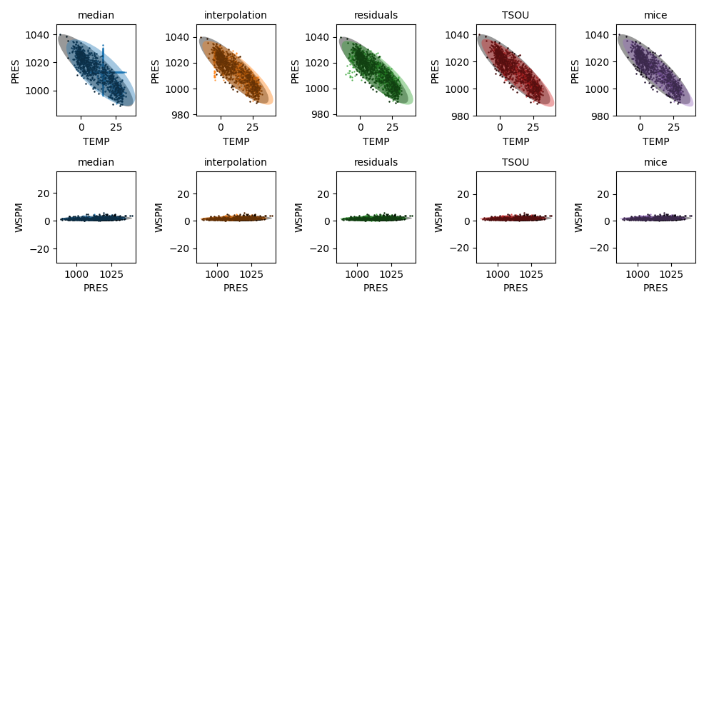
We can also check the covariance. We simply plot one variable versus one another. One observes the methods provide similar visual results: it’s difficult to compare them based on this criterion, except the median imputation that greatly differs. Black points and ellipses are original dataframes while colored ones are imputed dataframes.
n_columns = len(dfs_imputed_station)
fig = plt.figure(figsize=(10, 10))
i_plot = 1
for i, col in enumerate(cols_to_impute[:-1]):
    for i_imputer, (name_imputer, df_imp) in enumerate(
        dfs_imputed_station.items()
    ):
        ax = fig.add_subplot(n_columns, n_imputers, i_plot)
        plot.compare_covariances(
            df_station,
            df_imp,
            col,
            cols_to_impute[i + 1],
            ax,
            color=tab10(i_imputer),
            label=name_imputer,
        )
        ax.set_title(name_imputer, fontsize=10)
        i_plot += 1
plt.tight_layout()
plt.show()
Total running time of the script: (0 minutes 31.531 seconds)